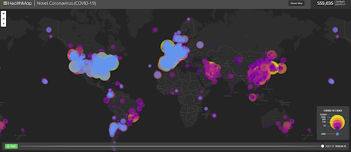
Healthmap
Information is Beautiful COVID-19 Data Pack
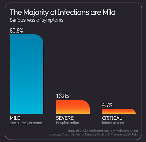
This shows the impact of the virus from the perspective of the severity of the symptoms. As has been reported, a significant number of the cases reported in the early stages of the outbreak in China resulted in relatively mild symptoms. However, looking at the underlying numbers shows the actual impact from a patient perspective. Of the sample of 44,672, those classified as Severe account for 6,165 hospitalizations, and those classified as Critical account for 2,100 intensive care patients.
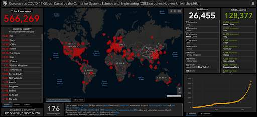
Johns Hopkins University
Sources